Sarah Calderon
Ms. Bjork
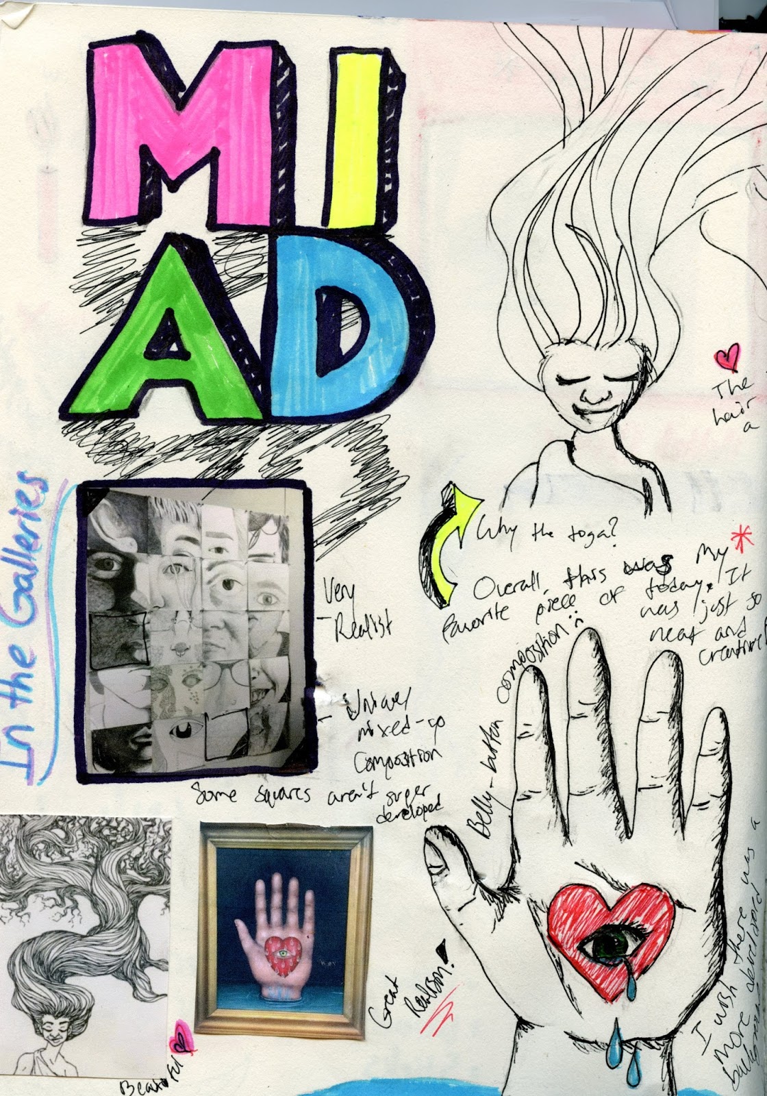
Graphic Design B3
1 November, 2016
Alternative Art~Artist Statement
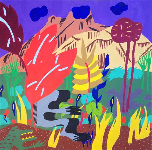
Modern artists have found new and creative ways to use materials, sometimes even creating their own media. In our latest project for AP Art, we were asked to be just this: create art unlike anything you’ve ever made before. Overall, by using the alternative media of leaves with a variety of art materials and techniques, such as collage, stamps, pastels, charcoal pencils, watercolor pencils, and paint, I was able to create a unique piece of alternative art.
When thinking of my concept, I was really inspired by the colors of fall. Fall is my favorite season, but this fall has been very different. I’ve moved, switched jobs, gone through a breakup. Like the leaves of the trees, this is a big change. But it’s also a beginning. Leaves fall, reminding us that a new year will be blossoming, one that is hopeful. I wanted to portray the happiness of the season compared to the person, so I created a vibrant background collaged with bright colors. The profile of the girl is black and white, however her eyes are fall colors. I did this to show that while the season is happy and colorful, it is inspiring her to be more hopeful.
Overall, I believe my drawing of the girl and background were very successful. I really like how different this piece and it’s color scheme are than anything I’ve done so far this year. Despite my successes, I believe I could have improved on the leaves. With all the different medias, the leaves got a little messy, however the path is well defined. I think it will be interesting to see how the leaves age and what that will do to the piece; the leaves will die as the year fades away


